

2018 ultra violet
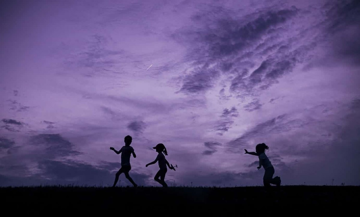
Every year, the colour experts at the Pantone Colour Institute pore over research and analyses of design, film, food, fashion, art and entertainment, as well as materials, travel, sports and technology, to arrive at a colour of the year. This year it’s Pantone 18-3838, also known as ultra violet. Pantone describes it as a “provocative and thoughtful purple shade” that embodies individuality and spirituality. It alludes to the mysteries of the cosmos and the unknown. Laurie Pressman, vice-president of the Pantone Colour Institute, said: “The Pantone colour of the year has come to mean so much more than ‘what’s trending’ in the world of design; it’s truly a reflection of what’s needed in our world today. We are living in a time that requires inventiveness and imagination. It is this kind of creative inspiration that is indigenous to Pantone ultra violet, a blue-based purple that takes our awareness and potential to a higher level. “From exploring new technologies and the greater galaxy, to artistic expression and spiritual reflection, intuitive ultra violet lights the way to what is yet to come.”
What defines “the colour of the year”?
Different socio-economic factors effect the choice of “colour of the year”. At the start of the recession of 2008, grey started to come into its own—traditionally the colour of hardship. During a recession we also tend to see a resurgence in the industrial look with materials such as concrete. In the years since, as we have recovered economically, the greys have become progressively warmer.
Pantone’s choice of Greenery last year was also a response to socio-economic factors. The choice of colour of the Year is mostly determined by what people need. For 2017, it was all about the ‘re-’ words, such as ‘re-energizing’ and ‘revitalizing.’ What was needed was a colour that could calm people down. Having that colour inside allows the mind to make a link to the outside. The following decade saw the global campaign to save the world’s rainforests and the beginning of the environmental movement and “green” politics. The word has entered the modern-day lexicon as a shorthand for responsibility and a purity of purpose.
Colours in interior design
Decorating one’s home environment with colour is, of course, also about self-expression. It allows you to achieve what you want from your home, as colour affects how you feel and behave. If we want a space in which to relax, we can create that mood with muted tones of grey/blue, as they look and feel harmonious and calming. If we want a room to get us motivated, we need hotter, more energizing colour such as reds and yellows. White, which symbolizes a blank canvas, is best if we need to be creative—it’s not distracting.
“Blue is regarded as the colour of constancy, of loyalty and faithfulness, anywhere in the world,” colour experts say. “Why? Because the beautiful blue sky brings a feeling of serenity and peace.”
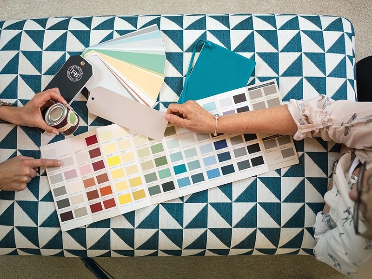
Still when we are about to choose the “right” colour, it always depends on the place, people and circumstances involved. If the mantra of real estate agents is "location, location, location," for colourists, it is "context, context, context”.