
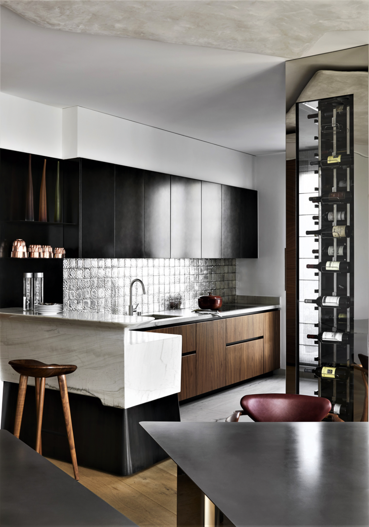
The marble! What other material can match its radiance, strength, style and elegance? With the history embodied in its every vein? What could resemble its colours - delicate or intense in startling tones and shades, from deep black to sparkling white, through blue, pink, green, gold... We take a peek beyond our knowledge of marble thanks to three global specialists who know it first-hand.
by Kalina Konstantinova
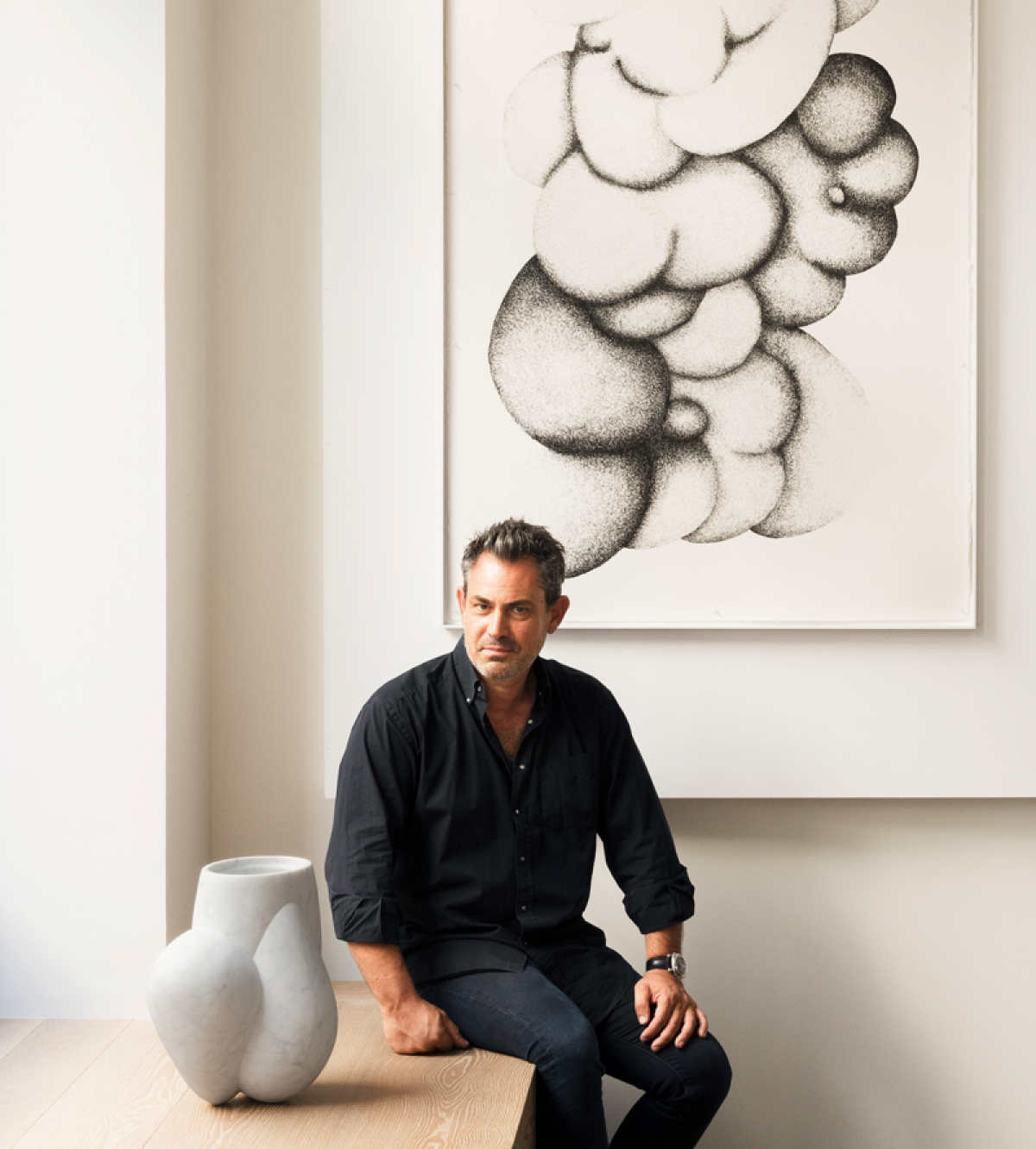
Three generations of the Morvidoni family have specialized in finding and working marble for furnishing and decoration. As the owner of Les marbreries de la Seine, he collaborates with some of the most renowned architectural offices in the world for prestigious projects of private homes, hotels, restaurants, and yachts. Three years ago, Jean-Pascal also created M éditions, a company that allows young designers to design furniture, decorative objects and works of art in marble.
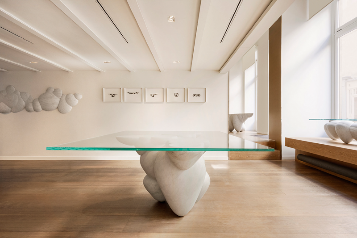
Les marbreries de la Seine has a large factory on the outskirts of Paris. Our showroom was there. However, we had a desire to create a more intimate and artistic space in Paris. We approached the designer Francesco Balzano, who designed it. Francesco also created a special collection of furniture that we liked so much that we decided to commercialise it (the Dolce collection). This is how the idea of M éditions came about. We wanted to tap into the talent of other young designers, to allow them to get to know our favourite material and be surprised by their proposals.
They must share our environmental sensitivity. At Les marbreries de la Seine, we've held QSE certification for 13 years - we recycle water, and waste. For us, caring for nature is not a fashion phenomenon. In the Fragments collection that we created with Anthony Gueret (Habitat's new artistic director), for example, we used blocks of marble left over from our other projects, too small to be reintegrated. These beautiful but redundant volumes found a new purpose - furniture, lighting and decorative objects inspired by Greek architecture and the work of Le Corbusier. Our marble comes from all over the world, but mainly from Italy. There is now a strong sensitivity on the part of companies and architects to the local provenance of the materials used. Or for the one with the smallest possible carbon footprint.
In recent years, we have seen a lot of green shades, and now pink, and blue are in fashion. Before that, beige. In the 1960s, my father was the biggest travertine dealer in France. The material was fashionable then, after which hardly anyone looked for it. It is now reappearing. When strong communication is created for a stand-out project, an interior, or a hotel... it becomes an object of desire. During the pandemic here in France, celebrity chef Cyril Lignac was featured on a popular cooking show, photographed in an interior with a Patagonia granite kitchen countertop. After that, everyone wanted a countertop like that at home.
The most expensive marbles are those that are difficult to find and process. Years ago I knew Mr. Burghini well, an Italian who owns the Calacatta Burghini quarry. His marble clads some prestigious interiors and has since become something of a reference for Italian style and elegance. Everyone wants it, but the quantity is limited, so the price is rising. The material itself may not be very expensive, but the delivery, the processing, the architectural design, and the way it is placed and displayed all increase its value. And you can make stunning projects that look luxurious with more basic materials. There are truly special projects, with one order for a kitchen worktop in blue sodalite costing €250,000. But here we are already talking about a semi-precious stone. No matter how expensive a material is, if it is not presented well, it is ruined.
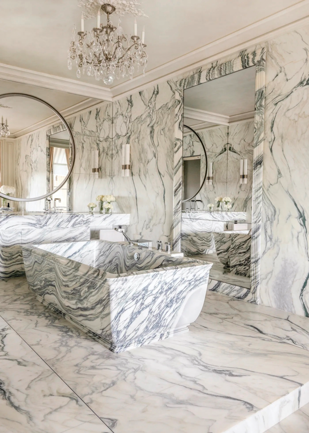
I worked with Mr. Karl Lagerfeld on the interior renovation of the Crillon Hotel. It was an amazing experience because of the volume and monumentality of the work, but also because of the contact with this extraordinary man. Finding the material was a real odyssey, and then, when working on one of the tubs, the so-called "egg" appeared in the mass of marble (an egg-shaped form in white that stands out sharply from the general mass, but is impossible to notice before cutting the volume). Although everyone was very worried as this defect changed the overall look of the tub, Mr. Lagerfeld liked it very much. The bath interior went around magazines worldwide and has been in all the most beautiful bathroom charts ever since.
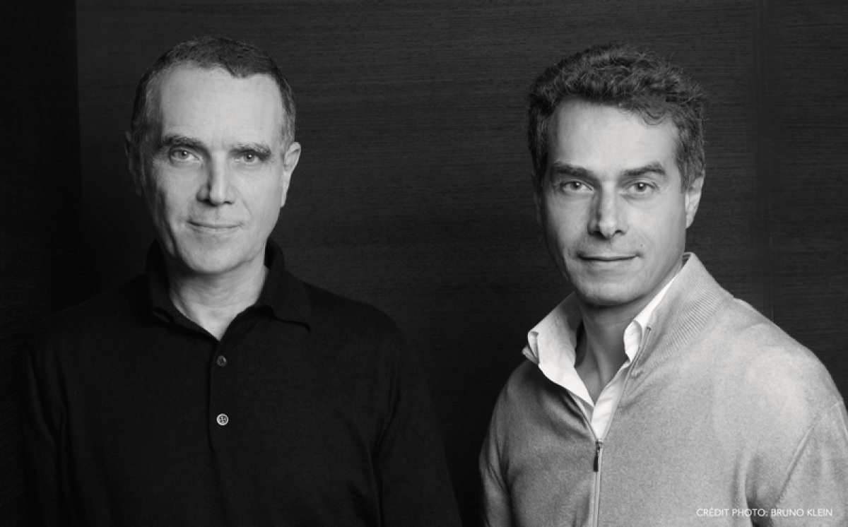
Brothers Daniel and Michel Bismut are French architects and interior designers. They create personal designs for residential and commercial properties, high-end apartments, embassies, hotels and concept stores around the world. They are distinguished by their taste for clean lines that emphasize light and perspective. We meet them on the occasion of their new limited edition Smiley collection.
Marble is and will remain a luxury material even if it is widely democratized and copied. The real luxury is the way it is processed and used. We use marble when the budget allows it and the project deserves it. All marbles are beautiful, but some are truly abstract art. Even if there are fashion trends in marble, we don't stick to them - architecture should be free of ephemeral phenomena. Only then will it be relevant in tomorrow's world.
Travertine has regained its glory, although we have loved and used it since the first projects. Patagonia granite is very much in demand. There is less interest in Carrara marble, and it is outstanding.
Thanks to them, we participate in many interesting projects because the possibilities are almost limitless. For example, with a robot, we created a spectacular fireplace made of solid marble from Rajasthan, sculpted like origami, and carved to 4 mm to create transparency.
Greg Natale is an Australian architect known for his bold and daring approach to furniture. His interiors are distinguished by their bright colours, accumulation of accents, and combination of fabrics. In many of them marble plays a major role. We meet at the Maison et Objet, the French furniture showroom, where the architect is presenting his new collection of furniture and decorative objects.
My love for it is connected to my Italian roots. My family and I in Australia lived in interiors with marble floors, and in Italy, I was struck by the amount of marble used everywhere from staircases to window frames. Marble exudes a sense of solidity and timelessness, warmth, and softness. This contradictory combination of strength and grace is appealing. There is something sumptuous about the bright or more subdued tonalities and the dynamic strokes of the veins forming abstract panels.
I am inspired by Italian design, which formed my love of geometric lines. In one of my most recent projects, Mosman House, I created a flooring of slabs in shades of pink and white, combined with others in burgundy and emerald, as well as those with less prominent veining and others with more intricate touches. The overall feeling is one of vibrancy but also of timelessness and grandness. The inspiration for this project is Villa Necchi Campiglio in Milan. I also like a postmodern design from the 1980s and often use granite - I find it evocative and distinctive of that era. It echoes the steely colour palette of the Paul Rudolph-designed Halston townhouse in Manhattan, which is another timeless inspiration of mine.
A lot of the material comes from Italy - the Paonazzetto, Rosso Levanto and Nero Marquina types. But we have also worked with amazing green marbles from India and Guatemala. In many of my interiors, I use the classic combination of white and black with Carrara and Nero Marquina. I love the interesting patterns of Jurassic, which I recently used in a project in East Brisbane, and the bright colours of Rosso Levanto and Guatemala Verde. Azul Bahia can dynamise an interior with its piercing blue.
In the Mosman project, we created portals of Granito Louco quartzite within the main living, dining and kitchen areas to delineate each. This incredible stone with picturesque veining envelops all thresholds, climbs door frames and covers partitions. The execution was very labour intensive - we used a thin (5mm) veneer of stone over honeycomb, creating the illusion of a sturdy frame of thick columns and solid beams. Combined with the gleaming white plaster, the result is dazzling and optically enlarges the space.
Marble is opulent, it excites, it creates a sense of drama, it gives a sense of monumentality. It is pleasant to the touch. But it is part of a diverse palette of materials and the balanced combination of all of them forms a truly luxurious interior.